Context:
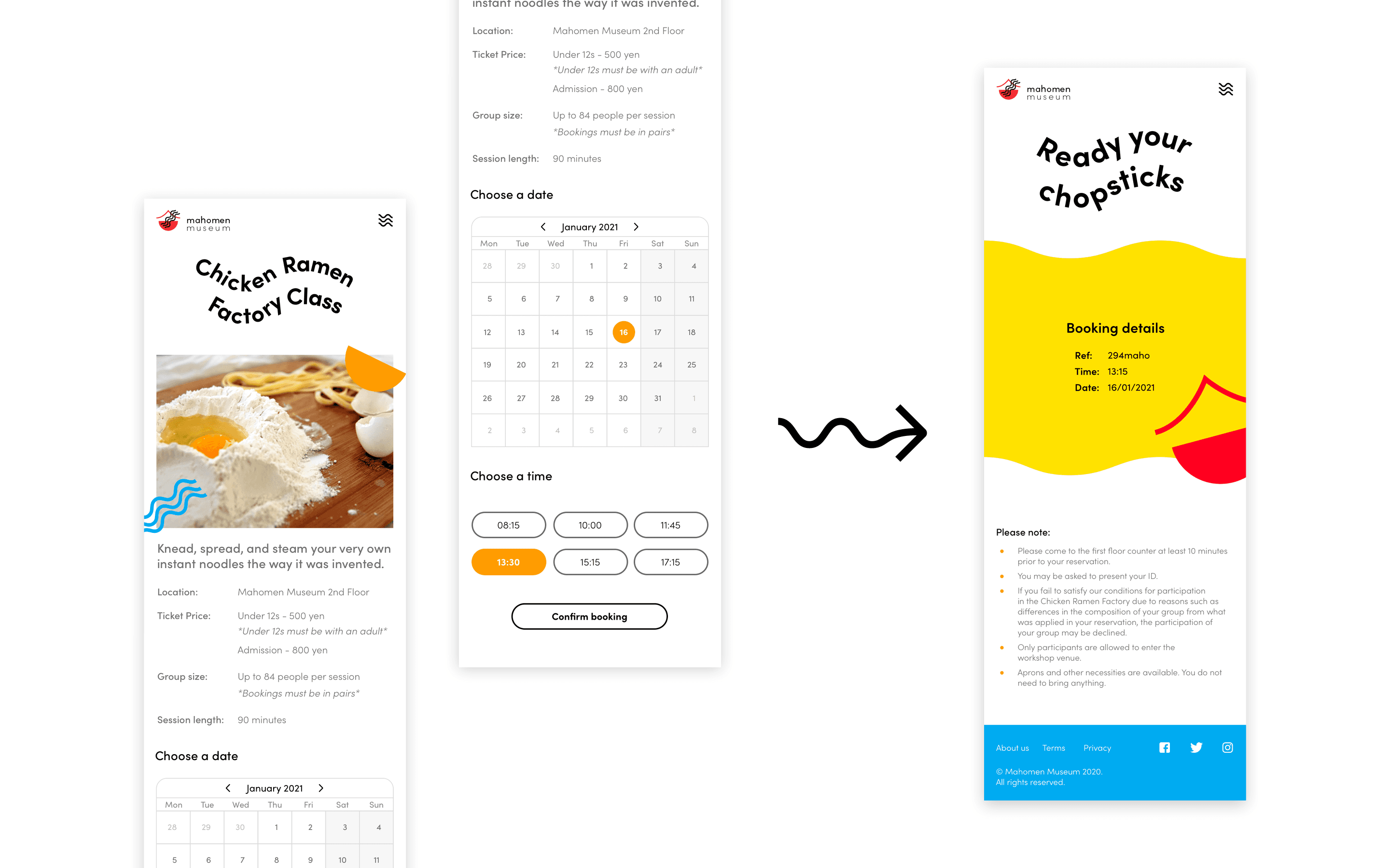
A passion project aimed at redesigning the CupNoodles Museum in Osaka to create a more welcoming atmosphere for families. The newly crafted identity injects a sense of fun and vibrant colours into the museum, making it more appealing to its intended audience.
The playful fusion of 'Maho' (magic in Japanese) and '-men' (from ramen) in the name is easy for young children to say. Paired with vibrant colours and a strong personality, it transforms their current sterile feel into an inviting and engaging experience.


