Context:
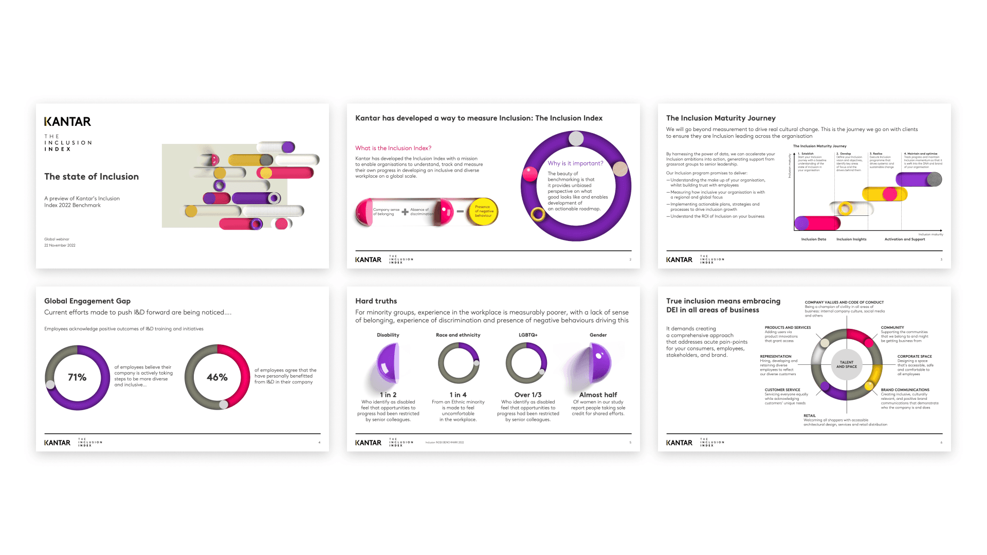
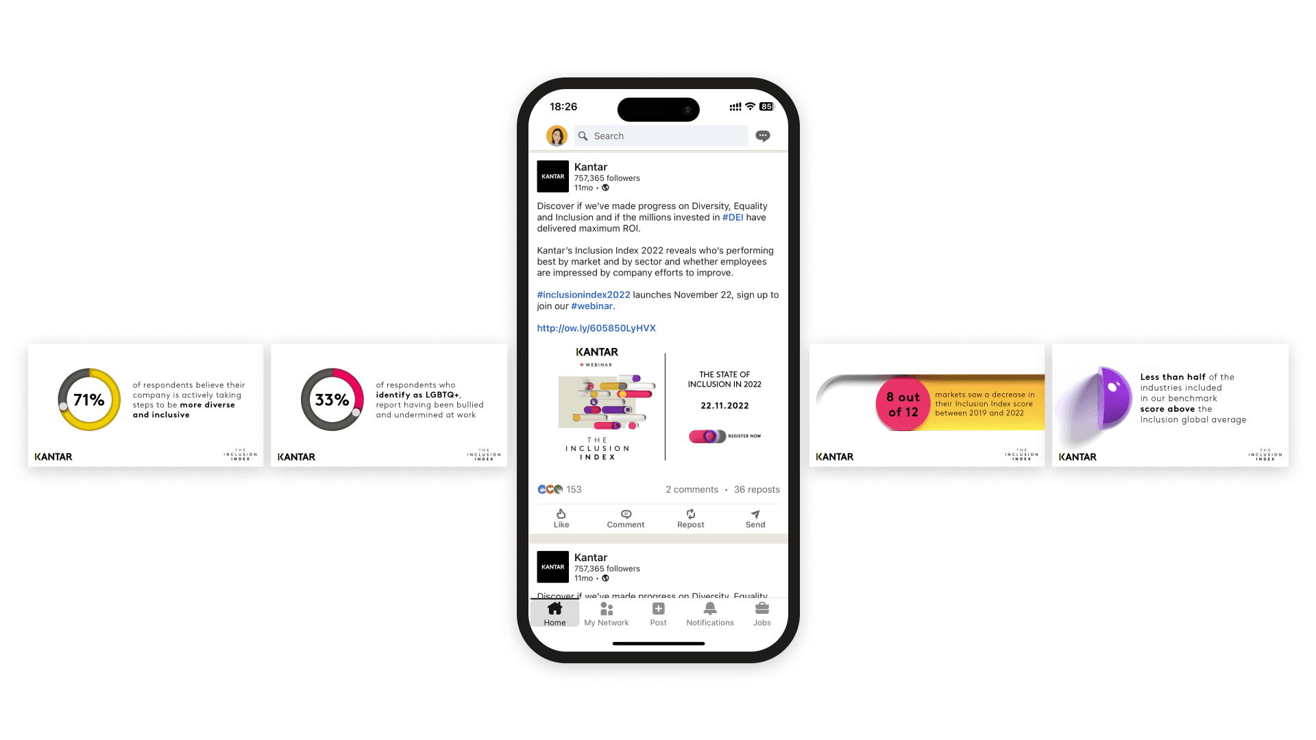
I designed a brand identity for Kantar's "The Inclusion Index" tool, which uses benchmark data to offer unbiased insights on the advantages of investing in Diversity, Equity, and Inclusion. Given its crucial social role, it needs to be inclusive and representative.
Photography can unintentionally exclude some groups, so the best response for this brief is an abstract one. A circular shape symbolises inclusivity, as it lacks corners and points. The specific selection of Kantar brand colours also enhance visibility for visually impaired readers to ensure accessibility to all.


